Showing posts with label tutorial. Show all posts

May 15, 2015

Photography Tips for Streams/Waterfalls


Remember the glorious waterfall featured in my May 4th post? This view was on the other side of the road bridge. The water may appear to be flowing upward in the image, but the view is actually of the water flowing downstream. This photo serves as an important reminder about turning around to discover another composition. The scene looked so magical that one might suspect a woodland fairy was lurking right behind that tree!


Great Smoky Mountains National Park, Tennessee

My dear friend, Ms. Vee (A Haven for Vee), kindly asked me to offer some tips on how to photograph streams and waterfalls, like this example. I am happy to oblige. The April workshop was the first time I have ever tried the technique.

September 15, 2014

Creating Animated Gif Files


The post this weekend for A Personal Photo Challenge was a big hit with my blog readers, thanks to a cooperative hummingbird and a couple of adorable rabbits. The rabbit photos sparked some excitement, and I got several inquiries about how to create animated gif files. 

I used Photoshop CC, a program that provides the technical power to line up all the photo frames seamlessly, in addition to animation. But you don’t need Photoshop CC to create animated gif files of your photos. You can use Photoscape, a free photo editor for Windows and Mac computers. (Note: The Mac version is scaled down, unfortunately).


February 11, 2014

Notegraphy - Graphic Design Application for Text


I have always been fond of quotes, and I collect favorites on a regular basis.  So I was very happy to find out that there is a new web/mobile application that I can use to showcase them in a beautiful, graphical form. And these little gems are perfect to adding some visual punch to my blog now and then.


The application is called Notegraphy.  It is available for iPhones and iPads (free), and an android version will come out soon.  Notegraphy is incredibly easy to use.  After setting up an account, you simply type in your text and then choose a design and color combination.  Right now, they have about three dozen styles and more will be added over time.

December 12, 2013

The "SNOW" Decorative Word Project


As usual, I am running behind on completing tasks. My attention is easily diverted on normal days, and it’s even worse during the Christmas season. Our cottage is decorated (minimally), but I haven’t gone around to take photos and share them here on my blog. Perhaps I’ll get that done in the next week, perhaps not! No promises. It’s all about priorities, right?

Despite being pulled in many different directions, I managed to recently get a quick décor-crafting project completed. And it’s good for the entire winter season, not just for Christmas!

November 17, 2013

Links for Birdseed Hanger Tutorials


In case you are interested in making some birdseed hangers, I have pinned a couple of tutorials. Here are the links:

http://www.pinterest.com/pin/134545107589393474/
http://www.pinterest.com/pin/134545107587752104/

It would be a fun project to do with kids and grandkids. And the birdseed hangers would also make nice gifts for this time of year.

If you want to buy birdseed hangers ready-made, like the ones I have, you can order them online from Gardener's Supply Company.

November 7, 2013

Blogging Tip - Open Link in New Window


I don’t know about you, but I frequently visit hyperlinks in blog posts. And, like following most rabbit trails, sometimes I have trouble getting back to where I started! So please do yourself and your readers a favor by making sure that all of your links open up in new windows. It’s easy! Just click the first box in the lower left of the “Edit Link” popup window. 


July 29, 2013

Have Your Blog Posts Been Pinned?


Are you ready for another blogging tip? I think I hear a collective “yes” from the crowd. I’ve discovered an easy way to determine which blog posts have been pinned on Pinterest!

I have personally pinned some of my posts in the past year. But it is surprising to see how many times others have visited and pinned my blog. There are now over 150 pins directed to my blog site!


July 27, 2013

How to Back Up Your Blog


I got some blogging tips for you today! Do you back up your blog? If so, good for you! If not, would you like to learn?

With my extensive photo inventory, I am rather zealous about backing up files. The Time Machine program is set up on my trusty Mac computer, and I utilize multiple external hard drives. But there are some backup tasks that have to done manually. So I set up reminders on my computer’s calendar to make sure that I get them done. One of those manual tasks is saving a backup of my blogs on a monthly basis.

In the world of cyberspace, bad things can happen. Blogs can be hacked. Templates can get messed up. So it’s best to save all of the hard work that has gone into your blog in case disaster ever strikes. And, Blogger really makes it easy to save your blog files.

July 30, 2012

Photographic Creative Process - An Example


The more I have learned in my photographic journey the past few years, the slower I work. There are times when I get discouraged about how long it takes to digitally process my photos. One thing that slows me down is shooting in RAW format instead of jpeg. So every image needs basic adjustments before I start to “play” with it. Fortunately, I have progressed to the point where I usually envision the final image in my mind’s eye before I close the camera shutter. And, being a true engineer, I like to fuss over the details of my images. I don’t want my processed photos to have a typical snapshot look. When I sit down at my computer and start the second half of the creative process, it takes time. Let me give you an example. 

A couple of weeks ago in Sitka, Alaska, we staked out a rocky beach near the harbor, intending to take photos of eagles. It had rained that morning so we couldn’t go out early. We waited until the rain stopped. The tide was in when we got to our destination. However, eagles like to fish that spot along the shore when the tide was out. We saw only one eagle, and he teased us by staying too far away for our camera lenses. Drat! 

February 5, 2012

Adding a Favicon


I recently got around to adding a favicon to my blog. Have you noticed? I was surprised at how easy it was to get it accomplished! 

Some of you may be asking, “What on earth is a favicon?” The word stands for “favorites icon.” It is an image displayed in the web address bar and also a favorites menu. If you have a site on the Blogger platform and you haven’t added a custom favicon, the automatic default image is the Blogger symbol - a white capital B on an orange-colored background. 

I switched out the standard Blogger icon with a customized one of a rabbit. (Marty, my official blog greeter, did the choosing.) If you look up in the web browser address line, you’ll spot the little cutie in front of my blog address. 


The hardest part of adding a favicon is deciding the image. Because it is so small, it needs to be a very simple design. The image also needs to be square and sized no more than 100KB. 

Once you have your design prepared, go to Blogger’s Layout control panel. The favicon block is shown in the upper-left of the layout. Click on Edit


The Configure Favicon screen will pop up next. Choose the file stored on your computer and upload it. Hit the Save button. That’s it! 


It may take a little while for it to show up, so be patient. My rabbit favicon took about a day before it finally made its appearance. And, if you ever change your mind and want different design, you can go back to the Layout screen to edit. 

I see that some of my blogging friends figured out how to do this little customization long before before I did. The new Blogger interface makes it as easy as pie. Like I said, the hardest part is figuring out what picture to add! Logos of flowers, animals, and initials seem to be the most popular. 

Have I inspired you to give it a try on your blog?

January 29, 2012

Handmade Greeting Cards


Have you checked out the price of greeting cards these days? Oh, it’s enough to give you a fright! Several years ago, I decided to forgo my regular visits to the local Hallmark store and avoid the greeting card aisle at Wal-Mart. What’s a budget conscious gal going to do? Make her own! 

I started out doing stamped designs, but then later changed to making cards using my own photographs. The cost per card is a fraction of store prices. It’s also much more satisfying to create something uniquely beautiful. As a bonus, recipients appreciate the thoughtfulness of receiving a handmade card in this cookie-cutter world. 

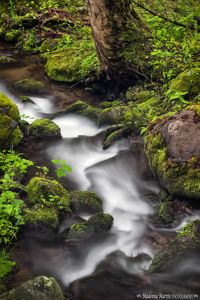
I like to make two cards out of regular size cardstock. A finished card is 4-¼ ” by 5-½”. Envelopes are easily found for this size at office and paper supply stores. For a double border, I size rectangular photos down to a maximum width of 4-¼” and print four to a page. I use to Epson's Premium Presentation Paper with a matte finish. I also go through through my stash of cardstock to find colors that complement the photos. 


I gather up my other supplies and tools, such as my nifty paper trimmer with a rotary cutting head, double-sided adhesive, bone folder, basic cardstock, black cardstock, and custom self-adhesive labels. 


The background colors I picked are keepers! 


Next, the photos get trimmed up and stacked. 


The photo stacks are ready!


Then I start taping the photos to black cardstock pieces (to help make the images “pop”) and colored card stock. 


The next step is to cut the matted photos apart and trim, leaving a ¼” margin all around. 


I cut the cardstock in half and score each half down the middle for folding. I forgot to take a picture of the scoring board earlier! You don’t have to have one of these, but it does make the job a little easier. And you’ll notice that I didn’t use a plain white cardstock for the cards, but one with multi-colored speckles. 


Then I start taping the photos onto the cards. The final step is to apply a decorated adhesive label on the back of each card. I designed and printed out the labels using a free Avery software program. The rabbit silhouette was created with a Martha Steward punch. 


And here are the final results of my card-making endeavor. It is a little time consuming, but I enjoy the whole process. If I ever get to the point of selling my cards, then I will be exploring the use of printing services. 


March 6, 2011

Hopping-Good Font

bunny-numbers

Marty here, your charming blog greeter! Donna stepped away from the computer momentarily, and I’m doing a guest post. Ha-ha, won’t she be surprised? She’ll get annoyed when she sees my fur all over the keyboard, but I’ll wiggle my ears and pour on the charm.

I wanted to share with you a bunny rabbits font! Aren’t these adorable?! Yeah, just like me! I downloaded the font HERE. The Dafont web site has a whole bunny herd of specialty fonts to select, along with installation instructions.

It’s the Chinese year of the rabbit and Easter arrives on April 24! So you have two good excuses to use this hopping-good font!

March 9, 2010

Tutorial - New Window for Web Links


Are you ready to try a daring feat with your blog? This is an easy tip. No acrobatic tricks are involved and you will not expose your petticoats. I promise!

Many of us bloggers insert web links in our posts. I frequently include internet resource information for my readers, particularly when I am writing about our journeys. With the default Bloggers programming, when you click on such a link, your browser window navigates away from the blog page to the linked web site. And if you are like me, you sometimes lose your place and forget to go back and finish reading the original blog post!

To eliminate this aggravation, I made a change to my blog’s html programming a few months ago so that my web links open up into new windows. If you want to make this template change too, here are the steps:

That’s it! Now try it out and then order a young person to do a cartwheel for you!

February 8, 2010

Applying Photo Textures


Thank you so much for all of the lovely comments on my recent picture of a new horse neighbor! I would like to show you the value of using a textured layer to a photo. The above side-by-side comparison shows you the dramatic difference. Adding a textured layer doesn’t cover the sins of a technically poor shot. But it does provide visual interest!

The day that I took this image was a dreary one, and the washed out sky greatly detracts from the beautiful subject. So I added a coffee-colored layer to give richness to the overall image, erasing out the texture, as needed, on the horse subject. The layer I used was one of textured backgrounds provided by the talented and generous blogger at ShadowHouse Creations. If you would like to give this technique a try, there are several tutorials on digital editing with background layers on YouTube, including this particularly helpful one.

December 27, 2009

Photoshop Elements Tip - Orton Effect

Now that things have settled down a bit after our recent house sale and move, we have more time to play with our digital images and discover new web resources for information.

For example, Texas Chicks Blogs and Pics provides some very nice tutorials. One technique really caught my eye: the orton effect.  This effect is named after photographer Michael Orton, who blended two images of an identical scene, but with difference exposures and sharpness.

rustic red barn near Mt. Lebanon Shaker Village, NY

The photo I took of this red barn is lovely. But application of an orton effect gives it a nice surreal quality.

rustic barn with the orton effect

Using an adjustment layer, I also desaturated the image to give it an antique feel.

rustic red barn with orton effect and slightly desaturated

I hope that this gives you a little inspiration to try the technique out on your photos!

December 13, 2009

Blog Tutorial: Changing Minima Template for Wider 2-Column Layout

shaker basket, Pleasant Hill, KY
From the very beginning of my blog’s creation, I have liked the simplicity of Blogger’s Minima two-column template. This template version also allows the user to decorate the computer screen sides with one of the many pretty backgrounds available on the internet (or one of your own).
But I have longed for an overall format width the equivalent of a 3-column blog, so that I could have a wider main column. There are times that I want the flexibility to showcase special images in a larger format.
Look at the difference between the sizes of the first image versus the one below. As a reader, which size photo would you like to see? Would you like to change your blog format too? Well, read on to find out how I accomplished this task!
shaker basket, Pleasant Hill, KY
My personal photo, altered using multiple
textured image layers from Shadowhouse Creations

Prepare a new picture insert for your header, with an image width of 900 pixels. If you use a web link to a decorative blog background, replace your background to one designed for 3 columns.
Go to Layout, Edit HTML tab. As a safety precaution, copy the entire template coding and save it in a Word file. (Or create a separate blog for format testing purposes. You can always delete it later.)
To widen the header width, look for this text in the html language:
#header-wrapper {
width:660px;
margin:0 auto 10px;
border:0px solid $bordercolor;
}
Change 660px to 900px.
To widen to outer wrapper, look for this text in the html language:
#outer-wrapper {
width: 660px;
margin:0 auto;
padding:10px;
text-align:$startSide;
font: $bodyfont;
}
Change 660px to 900px.
The next step is to change the main column width, so look for this text in the html language:
#main-wrapper {
width: 410px;
float: $startSide;
word-wrap: break-word; /* fix for long text breaking sidebar float in IE */
overflow: hidden; /* fix for long non-text content breaking IE sidebar float */
}
Change 410px to 660px.
The last change to make is to widen the footer, so look for this text in the html language:
#footer {
width:660px;
clear:both;
margin:0 auto;
padding-top:15px;
line-height: 1.6em;
text-transform:uppercase;
letter-spacing:.1em;
text-align: center;
}
Change 660px to 900px.
Preview your new template. If you are satisfied, then click on Save Template.
The last adjustment to make is to upload your new header picture with the wider format.
The revised template will now allow posting of images that are a maximum of 640 pixels by 640 pixels. (I found that to be the optimum size to go with the revised main column width of 660 pixels.) For these larger image sizes, upload your image on a photographic storage website like Photobucket. (You can adjust pixel sizes in Photobucket after file uploading, if you prefer.) Then insert the photo in your blog post via a direct link, rather than uploading it into your Picasa web album.
So there you go! The above steps are certainly not cast in stone. These are merely the adjustments that I recently made for my blog, thanks to some online research. If you want to tinker with the pixel sizes to suit your tastes, then give it a whirl! And, if you totally mess things up and want to go back to a standard 2-column Minima template, then reinsert the original html language that you copied earlier.
I welcome your feedback on these instructions!

P.S. I did more exploring to figure out why my properly scaled, wider photos were being resized by the Picasa uploader back down to the 400 pixels maximum width.  This quirk was requiring me to do a web link to Photobucket to obtain the larger format image size in my posts. I did not know that Blogger had an updated post editor available.  It allows upload of "extra wide" photos.
To make the change, go to your Dashboard's Settings/Basic tabs. Scroll down to "Select post editor".  Choose "Updated editor" instead of "Old editor".  Problem solved!

May 24, 2009

And the Rest of the Chickadee Story

Eldreth Pottery salt-glazed pottery birdhouse
Thank you for everyone’s sweet comments about my recent chickadee pictures! How would you like to know more about the lovely birdhouse AND learn a little about the photography behind the pictures? A two-for-the-price-of-one kind of post? Oh my, I see a lot of hands raised up there! OK, get settled in your chairs and get ready to take some notes!

Hubby and I are fond of salt-glazed pottery. If we learn of a place that sells it in our travels, we make a point of visiting and shopping. On one of our many trips to the Lancaster area of Pennsylvania, we discovered the
Eldreth Pottery showroom in Strasburg. We were immediately charmed by the style and ingenious design of their salt-glazed pottery birdhouses. At their store, they have so many hanging from the rafters, we found it difficult to decide which house we liked the best. Eventually, we decided to get a large and small one, both with floral designs. The one pictured above is the large birdhouse, and it was the residence of choice for the chickadee family.

If you don’t have a chance to visit to one of Eldreth Pottery’s three retail outlets, there is a small selection of their birdhouses for sale in the “outdoor” section of their web site. One design feature that we like is how the roof section lifts off for cleaning. There is a lip on the opening of the bottom half, and a metal hanging ring fits securely below it. With the first chickadee family raised and gone, we can easily clean out old nest and then wait for a second nesting season to start. During the winter, we store the birdhouses in the garage so that they do not crack in cold weather.
baby chickadee, posing for its worldwide view on the internet

Now I will share with you a few photography tips behind the creation of new seasonal header featuring the cute baby chickadee. Of course, opportunities for shots like this particular example are largely due to the luck of timing. The picture above is the full-frame photo that I selected. I took about two dozen pictures in the course of about five minutes, and some of them I intentionally framed with the subject off-center, like this one, so that I could create a new blog header. I also made a few minor adjustments of the original file in Photoshop Elements, including cropping and the addition of text.

This one was among my top choices because of how the bird tilted its head, clearly looking in my direction. A light reflection in the crook of the tree in the background also provided a clear and distinct silhouette to the bird’s head. As I was taking pictures of the subject – the baby bird – I was mindful of what the background looked like so that there was contrast. I was slowly moving as I shot the series of pictures, working on the perspectives of the subject and the background. (And I also didn't want to startle the bird!) This is the first tip – know your subject and pay attention to the background so that it does not compete against your subject.

So how did I create that nice blurry background in this image example? I used two things in tandem while focusing on the subject: the f-stop and the focal length. The settings on my digital SLR were ISO-200, 1/80 second, f/5.6. And, I was using an 18-200 zoom lens. A small f-stop setting of 5.6 allowed more light into the camera and it decreased the depth of field. Additionally, the digital zoom was set on 200mm (equivalent of 300mm in 35mm format for film cameras). This setting flattens perspective, allowing the background to be much larger relative to the foreground. In contrast, if the zoom was set on 18mm focal length, the image would not only be wider in coverage, but more areas of the image would be in focus. This is the second tip – use your f-stop and focal length to your advantage.

Digital photography lets you learn much faster than film photography. You don’t have to break the piggybank on film and processing costs. And, you don’t have the time delay between when the image was taken and when you get a print back. By all means, experiment with your digital cameras! All it costs you is your time. Take notes while you take pictures. Set up a shot, mindful of your background, and take multiple images on different settings. Then check your pictures on the computer screen, while reviewing your notes. Have fun and learn!
Oh yes, and also sign up for periodic photo challenges by clicking on my sidebar link!

February 26, 2009

Photoshop Tutorial - B&W with Color Spots

Many of my blog visitors participate in or follow the routine Brenda Photo Challenge. Cindra of Knits & Pics & Favorite Things is the hostess for the next challenge and she picked a great theme. The challenge is to take an existing photo and change it through photo editing software. I promised Cindra to help out by posting a tutorial or two for everybody. I recently taught myself a new Photoshop Elements trick and decided to share it.

another culinary masterpiece by my hubby, the chef
So what does a Photoshop trick have to do with this yummy looking focaccia bread that my sweet hubby recently made? Mmmm, look at those roasted Italian tomatoes, onions, and fresh herbs. And YES, it smelled and tasted GREAT!
Okay, okay. I hear you! Enough with the gastronomical distraction, let’s get on with the tutorial! The subject of my tutorial is the picture I took of the bread before it got baked. The lesson shows you how to take a picture that looks like this…
… and change it to a picture that looks like this!


this is NOT meant to look appetizing, by the way - I just want to show the technique
I opened up a Photobucket account, uploaded screenshot pictures there, and inserted step-by-step instructions. If you want to learn this technique, please click on the link below.


I hope that you enjoy this little lesson and will try it soon on one of your pictures. In the meantime, we are snacking on that delicious bread!

November 19, 2008

Blogger Tip - Adding Captions

Some of you have noticed that I add captions to most of my pictures. If this is news to you, then you’ve been missing my hidden captions! Run your little mouse pointer over my pictures and discover what I’ve been saying!

Would you like to know how to add captions like these to your blog pictures? All righty then! Warm up those fingers, grab a nice beverage, and let’s have a lesson! This tip works if you use Blogger (sorry, typepad and wordpress folks), and you upload your pictures from your computer (sorry, photobucket folks). Okay, if these conditions apply to you, then keep on reading.

it's not pretty trying to understand HTML Code
To practice this out on your blog, go to your Dashboard and click on Edit Posts. Pick out a former post with a picture. Click on Edit for that post. See the two tabs on the right that say Compose and Edit Html? Click on the Edit Html tab. Now, now, don’t be frightened! I don’t understand HTML Code either, but you don’t have to understand it to do this trick. Look for the geeky HTML language for your photo that includes img id=. Now look for where it says alt"". In between the two quote marks add your caption. Make it informative, witty, insightful - whatever!

Now, go over and click on the Preview button. Run your mouse pointer over the photo and check your work. Got a typo? Go back into the Edit Html tab and fix it up. After you get done, hit Publish and go see your accomplishment on your live blog. Woohoo! Congratulations! Now let’s finish off the remainder of that beverage and dance for joy!

a conga line celebration is best done with high heels, hats, handbags, and corsages; a string of pearls is optional
Follow these same steps after you upload pictures for a new post. I usually add all of my photo captions as a last step before final proofing and publishing.

I hope you enjoyed this little tutorial. And, I look forward to seeing some photo captions on your blogs!