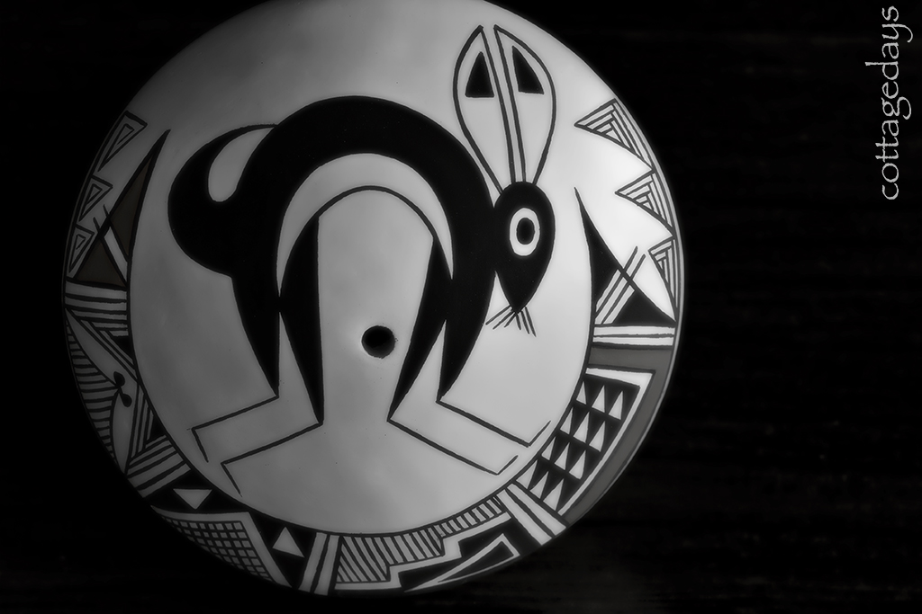
After I finished up with the previous photo shoot, I photographed another personal treasure. This one hails from the American southwest! We stayed a few days in Santa Fe when we visited New Mexico last year, and we enjoyed browsing in all of the trendy shops. One of our favorites was Andrea Fisher Pottery near the downtown plaza. My sweet hubby bought me a couple of early birthday presents here, and one of them was this adorable seed pot. Such pots were traditionally used by Native Americans to store garden seeds.
This artisan piece was made by Rachel Concho (age 76) of the Acoma Pueblo and features a mimbres-stylized rabbit and geometric designs. The intricate design belies its size. It is tiny in stature, measuring 2-1/2 inches across and 1-1/4 inches tall.
I applied minimal digital processing to the image shown above. The photo came out pretty, but I wanted to see if I could kick it up a notch. I applied a little bit of creativity in Photoshop and made some additional images from the original photo file.
Here is a dramatic low-key application in black and white. I cropped the photo slightly and applied some “glow” for more drama. With the clay texture smoothed out, one can clearly distinguish the pot as handmade, with whispers of shadows dancing across the painted white surface.
Next, I gave the image a vertical crop and applied a neon glow filter that inverted the black and white colors. I then chose a coppery tint to fill in the former white areas of the clay pot. Now it looks like it is made of metal!
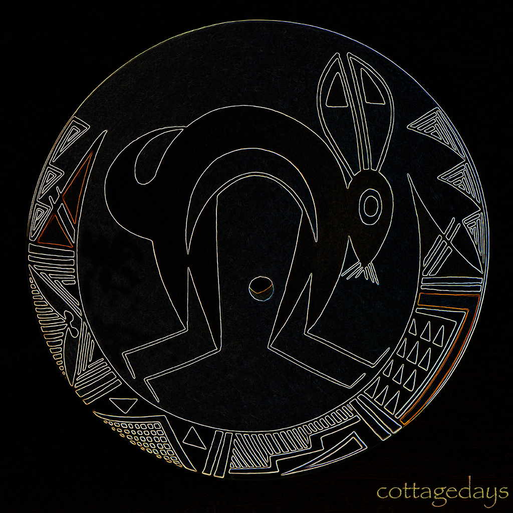
In my final attempt, I was compelled to take advantage of clean dramatic lines of the pottery decoration and the simplicity of the overall scene. So I cropped the photo into a square and applied a stylized filter with glowing edges. The image was transformed to show the pot’s outline and design with vibrant lines on a black background.
I had fun with my Photoshop playtime! I hope that this demonstration has also given you a giggle!


first, that's a very cool pot (and tiny!) i really like the 3rd edit - the metallic one. NICE!
ReplyDeletethe pot itself is very cool and I love all the different images you came up with. Your photoshop play time was very productive
ReplyDeleteYou had good bones to work with...I think that you know how to have fun.
ReplyDeleteIs That Marty in there???Hahaa..
ReplyDeleteLove when you find time to play in PS! We all benefit!!
hughugs
They are all very nice Donna! And I might add the tulips are amazing!
ReplyDeleteBeautiful! I love the "Marty" seed pot, and all the variations you did with the photo. Very Nice!
ReplyDeleteThe last two are kinda cool. And I like your new title bar. That's a very pretty tulip image.
ReplyDeleteOooh neat! The black and white one is my favorite.
ReplyDeleteVery cool photos of some gorgeous pottery! ♥
ReplyDelete