I had originally intended to set up still life compositions inside the house and practice some lighting techniques. Instead, I seized the opportunity to capture some still life scenes during our recent visit to the Museum of Appalachia, located in a nearby town.
Two of the compositions were located outside and one was inside a building. Each presented challenges in terms of lighting and set-up. In a museum setting, you can’t touch objects and rearrange them to your liking. (At least, not without getting in trouble!) You have no control over inconvenient shadows or mixed light (natural and incandescent, in the case of the indoor scene). At times, you are also limited to where you can stand. My original challenge images all required some Photoshop editing to make up for situational deficiencies.
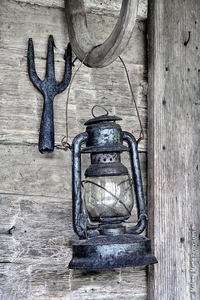
I really liked the blue cast of this vintage lantern and garden tool that were hanging on the outside of a cabin. So I desaturated the background yellow/red tones of the wood to further showcase the rustic blue tones. An eave overhang cast a shadow over the upper one-third of the frame. I found it distracting, so I removed it with a strategically placed light gradient during the editing process.
vintage lantern and garden tool
f/5.6, 1/80 second, ISO 400
The museum has the finest collection of mill stones that I have ever seen. Dozens are scattered throughout the acreage and presented in exhibit buildings. I was enchanted by this one because nature is eagerly blending it into the landscape. To deepen the contrast and depth, I added a low opacity glow filter in the post processing, similar to an Orton effect.
mill stone and vines
f/13, 1/125 second, ISO 400
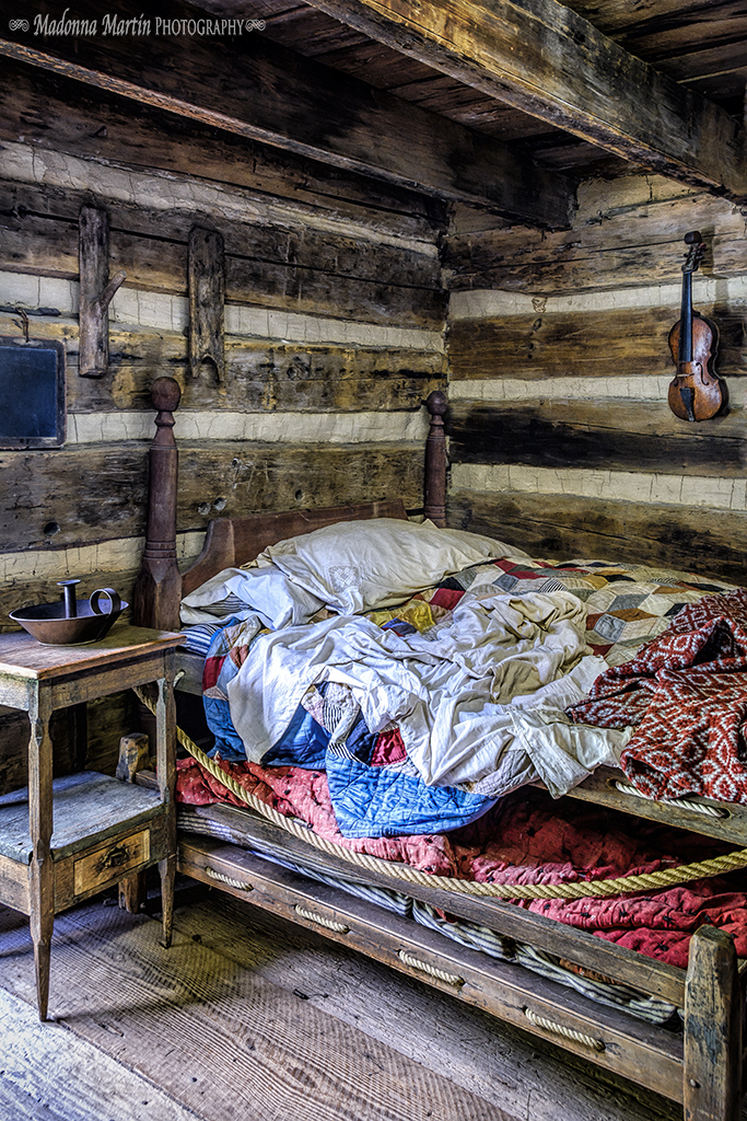
My final image shows a trundle bed tucked in the corner of the Mark Twain family cabin. The structure was moved to the museum from Possum Trot, Tennessee, and it was once the home of Mark Twain’s parents and some of their children. Mr. Twain was born about five months after the family left Tennessee in 1835.
I spent considerable Photoshop time on this image. The lighting was very tricky because natural light was streaming through a doorway on the left and bare incandescent light bulbs were located out of the frame on the right side. Different color casts were evened out in the post processing steps. I was also limited on where I could place my tripod because of an area roped off behind me. A wide-angle setting created curved lines in the original image, but I was able to make perspective corrections in Photoshop and still keep important elements in the frame, such as the charming fiddle hanging on the wall.
Mark Twain family cabin
f/9, 1/3 second, ISO 400
I hope you enjoyed my photos and descriptions. Please visit A Personal Photo Challenge blog and check out the creative efforts of other participants too!


I love them all!
ReplyDeleteThese are all great images but I want to straighten out that lantern in the first one! I'm sure the crookedness is part of its charm, but oh, dear. You do wonderful things with the great photos you take. The Mark Twain cabin is so crisp and clear. You definitely chose the right angle!
ReplyDeleteLOL, I wanted to straighten the lantern too, but it had to remain "as is." And if I tried to straighten it in Photoshop, the door jam would have been off-kilter. So it is a lantern that demands to be crooked!
DeleteThese are gorgeous...just like I'm right there.
ReplyDeleteBeautiful photos, Donna...you are so talented!
ReplyDeleteOh wow....fabulous photos, Donna! If I had to decide on a favorite, I guess it would have to be #3...what a moment in history it conjures up! I don't know what they looked like before you edited them but you did a fantastic job! Hoping you and Mr. Jim have had a good week and as always, thank you for hosting...have a blessed weekend!
ReplyDeleteTrying again... =D
ReplyDeleteLove the photos; love the description of the process.
really like the first one. beautiful! and the naturalness of the overgrowth on the millstone.
ReplyDeleteDonna, these are wonderful, and the first is really my favorite type of photo. Love the objects against the barn board.
ReplyDeleteI love the color of the lantern and tool and the fact that it is off kilter. It looks so good hanging against the old siding. My very favorite is the last because there is so much story in that photo. I also love the pop of red and blue which makes it a totally different picture than it would be without it. Thanks again for hosting such a fun challenge.
ReplyDeleteYou helped us see the possibilities with these photos. And the old wood sure is pretty as a background. I lived in a cabin that was over 100 years old in NC and it had one room with the original logs. They had been covered with newspaper but we cleaned it off and exposed it again. Thanks for this wonderful challenge! Sweet hugs, Diane
ReplyDeleteOH I loved them all :)
ReplyDeleteAll three of these are amazing images. I really like the first one with the way you desaturated the wood to emphasize the blue of the lantern and tool. I totally love the rustic charm of the last one.
ReplyDeleteI like those pictures, and I appreciate all the details you provide.
ReplyDeleteI love all three of these. The third shot has so much detail and texture. I feel like I could jump in there and take a cozy nap.
ReplyDeleteNow... I like the lantern crooked. It's in character.
I'm not very knowledgeable in post processing. Have Photoshop 7 and never learned to use it. But I did work on my entry the best I could with simple tools. It was a very flawed photo and I think I cleaned it up pretty good.
Very interesting subjects for your still life photos. I too am bothered by the off kilter lantern but as you say, you have to go with what is. The old wheel with the vines growing through does make a nice piece of garden art as in retired and laid to rest. The bunk bed scene has so much to tell of life long ago, a time when many quilts brought warmth.
ReplyDeleteThank you for hosting the challenge Donna.
I love your editing which makes all three pics really interesting Donna. Thanks for the details, all sound so easy when you explain them to us, but I don't use Photoshop, and quite honestly don't think I'd ever have enough patience to learn!
ReplyDeleteI can see that third pic published in a country style magazine, or it would be wonderful blown up and framed as it certainly resembles a beautiful painting. The rumpled bedding is so much more interesting than a made up perfect bed!
Thanks for the fun challenge and your kind comment on my entries.
Have a great weekend - hope you and Mr. Jim can get out and enjoy the autumn weather.
Hugs - Mary
I love these photos Donna. Anything old and historic is right up my alley. :) I had forgotten about the challenge and last night started doing my post up but the internet was really slow and I couldn't save it so I'm starting over this morning and will hopefully have it up soon. Thanks for all your valuable information and tips and for hosting. Always learning. Hugs. Pam
ReplyDeletegreat photos Donna. Love the lantern and the bed. Love to see what is in old museums and houses etc.
ReplyDeleteThanks so much. Wonderful.
Put my link up, sorry I seem to be a day late always, despite the time difference meaning I am a day ahead of you, well almost! ;-)
Outstanding work Donna...I'm not sure if my favorite is the lantern or the bed. I love both and I agree with Mary....the bed would make a gorgeous magazine cover! You have so much talent!!
ReplyDeleteEach one, perfect! I especially love the first one; reminds me of "over home" and what I would give to see that old house just one more time.
ReplyDeleteAs always, your skills are amazing, my friend.
xoxo
Wow, your photos are gorgeous! I thought I was looking at a magazine feature! I am so glad I popped over to take a look! Thank you for talking me through the process and sharing your ideas. Love it! xxDazee
ReplyDeleteI love your photos! I loved your descriptions...and am also challenged by them! I am amazed at the control you have over your images, deciding to straighten curved lines, change the lighting, remove a shadow. Oh the possibilities!
ReplyDeleteOh I love these especially the first with that blueish lantern.
ReplyDeletehttp://www.livingfromhappiness.com
Lovely, Donna. Your work is always inspiring. I've all but given up taking photos in museums because they never seem to turn out. Such a shame because the collections are always amazing.
ReplyDeleteBeautiful shots Donna! I'm ALWAYS late to the party aren't I...!!
ReplyDelete(((HUG)))