It’s time for another Brenda Photo Challenge! The current theme is Lighting. I was really excited to see this topic. Lighting makes or breaks your photo. It can be used to gently tease your subject matter or flood it dramatically. The viewer’s eye is always drawn to the lightest parts of an image. So savvy photographers leverage the composition of a scene by being mindful of how the subject matter is lit. And sometimes, light plays such a starring role that it becomes the true subject of a captured image. On those occasions, it steals the scene.
I chose all of my challenge photos from my digital inventory for Shaker Village of Pleasant Hill. Additionally, I added textured background images to enhance each one. All of the background images are courtesy of Shadowhouse Creations (see sidebar link).
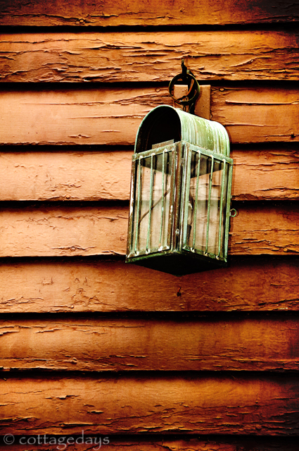
My first challenge entry is an old-fashioned lantern, hung on weathered clapboard siding. A gentle sideways glow of natural light is further assisted by strategically adding a darkened texture layer. Color balance and saturation were also adjusted to evoke a vintage feel. The image was taken at f/5.3, 1/60 second, and ISO 200.
light in the light
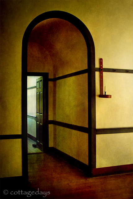
If ever there was a photo shoot location that teases you with light, it is the Centre Family Dwelling at the historical site. In the picture below, the afternoon daylight eases down the main hallway from the right. Meanwhile, a soft glow of indirect sunlight whispers beyond the open door. Both sources of light are reflected and playing tag in the arched vestibule. I added a light mocha textured background to give the overall image a painterly look. The camera settings were f/5, 1/100 second, ISO 800.
lightplay in a Shaker doorway
I have shown my fascination before on this blog with stairways in the Centre Family Dwelling. When one has a bad knee, it takes a bit of determination to walk up to the very top of this large building. But there are several views that make the effort worthwhile, including a staircase that leads to a rooftop window. It is a scene that makes a photographer’s heart melt, with dramatic lighting and strong visual angles. In challenging myself to make my picture even more striking, I was inspired to digitally superimpose an image of a cloudy sky. This blurs reality, melding the doorway and sky magically together. The image was taken at f/7.1, 1/4000 second, and ISO 800.
stairway to heaven
When the angels come to lead us on our final journey, this is what I imagine the trip will look like - a walk up a stairway, from darkness, and toward the light.


Beautiful light, great shot of the stairway ;)
ReplyDeleteJust stunning, each and every one of them. You never fail to impress me with your photos.
ReplyDeleteVery pretty, Donna! :)
ReplyDeleteOMGOMGoodness!!!!! I Quit...I'm taking Marty and we're moving to Brazil...HAhahaaa...
ReplyDeleteOh Donna, How beautiful!
These are ALL gorgeous but my favorite is the staircase! Nevermind How you did it, I love it!
SO glad you made the trek up those stairs for it!
hughugs
Those pictures are stunning my friend. I am loving the last one!
ReplyDeleteHave a great weekend.
Hugs
Kim
Beautifule photos. I especially love the last one!
ReplyDeletei may have mentioned this before? you really could publish 'coffee table books'. know what i mean? just the photo journalism type books, mainly photographs in oversized books, with very light descriptions of the photo (captions- or a line of poetry-- or somethin like that)
ReplyDeleteseriously , folks pay big bucks for books like those. 50 bucks a piece or higher. your photography blows me away. every time.
i'm seriously still thinkin of that melon skin in a frame-- really-- for my kid. no - i don't promote the behavior we spoke of,and she doesn't partake-- but she will be -- eventually , painting her room -- purple... i know.. i think that pic in a black frame would just look awesome there. maybe it's me.
anyhow-- again.. bravo-on your entry--
now go see my pitiful excuse :))
latah [scab] bw hahahahah
I like the first photo, it looks very classic. The antiquity of the lantern stood out. And yes the last photo looks heavenly.
ReplyDeletewow..just wow, Donna. you do it every time. A fantastic post. Good on you. And thanks for visiting my psalm.
ReplyDeleteThe textures, lighting, and composition of the first photo makes it my favorite but they're all so totally awesome!!!
ReplyDeleteOhhhh, you mean I have to think about ISO, too? For the second time this week, I'm asking a blogger to pardon me while I go bang my head somewhere. Ha! Beautiful, Donna, truly. I love the Stairway to Heaven. It's dreamy and mystical.
ReplyDeleteThe photos are awesome, but the last one brought tears of joy to my eyes. :D Praise God.
ReplyDeleteGorgeous my friend. I especially like that last one. It's a beauty. Very well done. Have a great weekend :)
ReplyDeleteStunning pictures. I love your work!
ReplyDeleteWill it be strong enough if I say MMMMMMMMMMMMMMM. Wonderful.
ReplyDeleteOh Donna I love that hallway! All are beautiful but that one just calls me in. That's for the heads up about those links will check them. ~Jeanne
ReplyDeleteAs always, simply beautiful. All are wonderful, its too hard to pick a favorite!
ReplyDeleteWhat a great job of bringing out the best in excellent photos! The last one is mysterious as well as beautiful.
ReplyDeleteThe photographers at Hallmark ain't got nuthin' on you, Donna!
ReplyDeleteDonna, I'm liking your photo style. I'll be watching your posts looking to learn a thing or two. ;)
ReplyDeleteI absolutely LOVE Stairway to Heaven- Now that is a gorgeous shot! Thank you sooo much for sharing!!!
ReplyDeletewhat dramatically spectacular photos...you've made me want to pull out my textures again....i've been so wrapped up in macro lately, esp with all the blooms....i have to say these are stunning locations.
ReplyDelete